Documentation
Appearance & theming
Match the widget to your brand: colors, presets, fonts, dark mode, launcher icon, position, and size.
Everything visual lives in the Theme tab of the widget customizer. Changes are saved to the widget and apply everywhere it's embedded, no need to re-copy the code.
What you can change
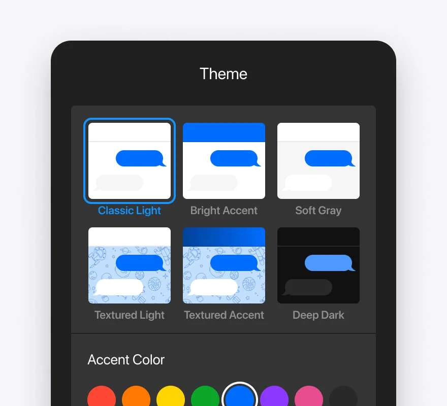
- Colors - primary/accent, header, chat background, user & bot bubbles, and input.
- Presets - one-click premium color themes to start from.
- Fonts - a set of curated typefaces.
- Dark mode - a dark variant of the widget.
- Shape & depth - border radius, shadow intensity, and bubble size.
- Launcher icon - chat, bot, help, or sparkle.
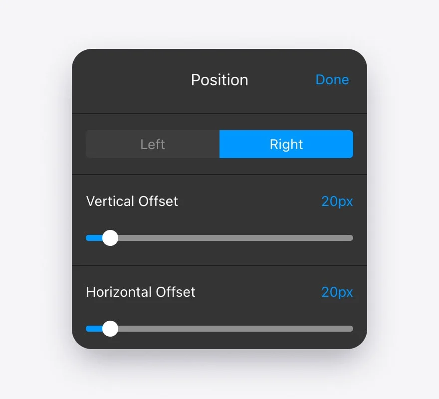
- Position - bottom-right or bottom-left, with optional offsets.